I spent nearly 15 years of my life lighting characters for animated films. And anyone that has taken a class with me or heard me preach about lighting, will inevitably hear me talk about the three keys to well-crafted images.
Creating Mood
Directing the Viewer’s Eye
Constructing Visual Shaping
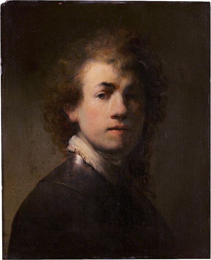
Constructing visual shaping is all about value differences. Getting the key side of the character to be bright and letting it roll off into the darkness on the fill side. I studied drawing and painting and sculpture and all the traditional mediums to understand this practice better. I learned about the principles of Rembrandt lighting on how they could be applied in 3D. I would would love it when I could craft a light rig that pushed that perfect Rembrandt triangle onto a character’s face.
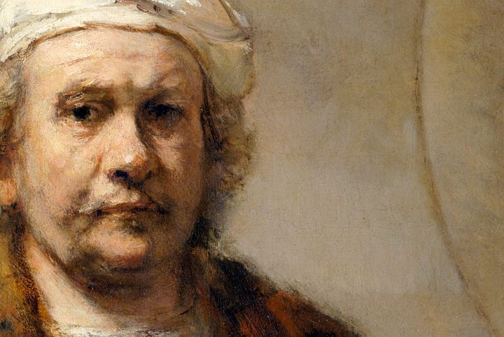
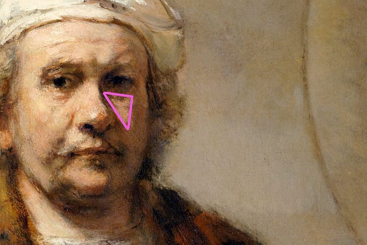
It was only after years of experience that I discovered that sometimes this approach was flat-out wrong.
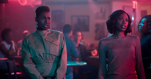
It started when I was working on the film Spies in Disguise and lighting dark-skinned human characters. I approached lighting the dark-skinned characters like like anything else I had lit but couldn’t get the character to look quite right. It was only after some early testing that our brilliant Art Director, Mike Knapp, instructed us to study the HBO show Insecure to see how they crafted the cinematography of their characters.
I was blown away by the style.
Minimal diffuse lighting allowing the dark values of the skin to stay dark and adding complimentary colored lighting to get some lovely reflections to create that shaping in a way I never anticipated. I was intrigued so I kept investigating.
I started seeing other examples of use cases like this, including Moonlight and Sorry to Bother You. I thought this must have been happening for years and completely missed it. But then I started checking out some older films and realized this was a new phenomenon. Early cinema directors did not have this same craft for dark-skinned characters, and it showed. So many old films had washed out skin tones and obliterated dark hues. What was the deal?
So I started to do some digging and uncovered the history.
In the early days of photography, artists needed a lot of light to produce an image on the early film stock. So lots a frontal lighting was needed just to get an image to appear. This worked great for light skinned characters but when these lighting techniques were applied to dark-skinned characters on film, it looked awful. The massive amounts of light pumped into the scene transformed dark skin a mid-toned value and the results were flat and washed out.
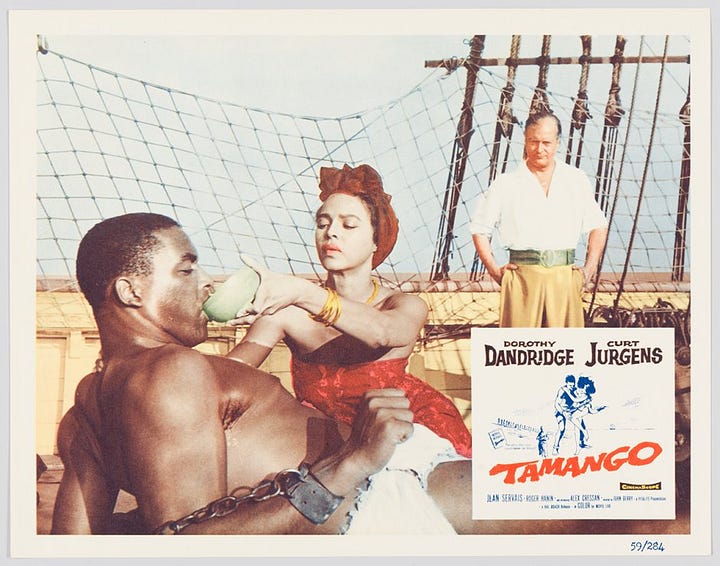

This was even worse in amateur photography. The reason was that Kodak and other film manufactures had come up with fast, easy ways to print lots of photographs with a massive machine. These machines needed to be calibrated so Kodak came up with something called the Shirley Card. This card consisted of some grayscale values, colors, and a skintone measurer. And although the model changed over the years, she was always white. This meant that all photos were printed to make light-skin look great while completely obliterating all detail in subtlety in darker tones
So the film wasn’t good enough to capture the darker tones and the printing process was calibrated specifically for white skin. Not great.
This started to improve in the 60s & 70s. So what caused this change? Did companies finally come to their senses? Did they listen to the complaints of dark-skinned people and make a much needed pivot? Of course not. It was because of wood and chocolate.
Furntire makers and candy manufacturers complained to Kodak that they were having problems capturing their stained wood and dark chocolate and pleaded with Kodak to provide a film for these darker subjects. So Kodak released Gold Max film for dark subjects.
But that was all that was needed! Soon, artists discovered new techniques for capturing darker skin tones with these new films.
So other than physical film, what's different? The Cinematographer Ernest Dickerson summed it up beautifully when working on the Spike Lee film Do The Right Thing.
And while we've come a long way, it's not always great. Take this controversial cover of Vogue that washed out Vice President Kamala Harris' skin tone by being too overly lit and matte.
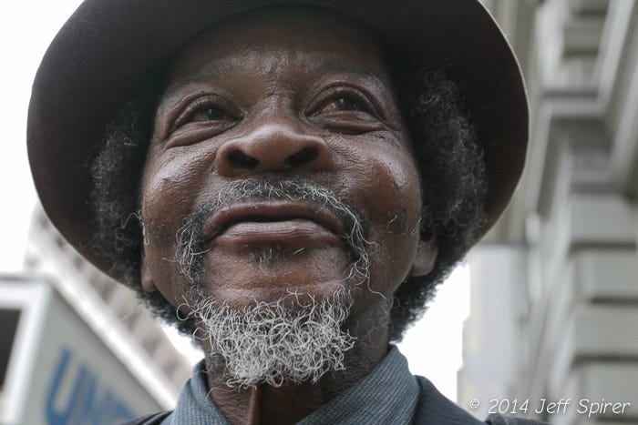
So when you are lighting your own characters for your projects take the advice learned from Ernest Dickerson and countless others. Don't flatten dark skin by over-lighting, overexposing, and making them appear matte. Think moisturizer, not makeup. Use reflections and highlights to provide shaping while letting the base skin tone remain dark
So no go there and practice and be better than you were before!
When working on dark-skinned characters, make sure to focus on keeping the skin tone on its true color while utilizing reflections and highlights to create shaping. Be like the amazing artists on Pixar’s Soul!
Source: New York Times
3D News of the Week
A roundup of interesting 3D related news you may have missed this week.
DreamWorks' MoonRay Renderer Is Now Open-Source - openmoonray.org
Xiaomi’s Wireless AR Glasses Cop a ‘Retina-level’ Adaptive Display - manofmany.com
Networking at GDC 2023: Tips for Artists, Game Developers, and Industry Leaders - 80.lv
Apple CEO Tim Cook Ordered Headset Launch Despite Designers Warning It Wasn't Ready - macrumors.com
Tentacular Is the Only Game That Does VR Right - wired.com
3D Artist of the Week
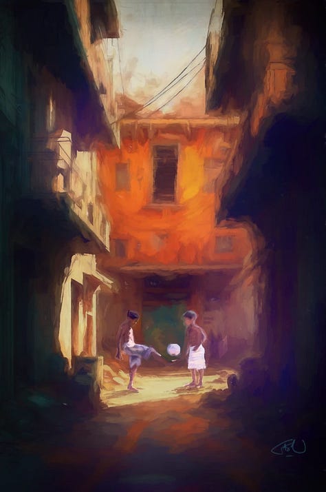
Gaston Ugarte
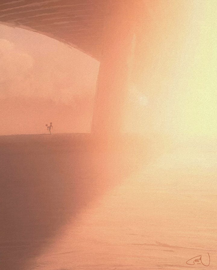
Art Director, Pixar Animation




3D Tutorials
Great breakdown how the look of film has changed over the last 30 years.
3D Job Spreadsheet
Link to Google Doc With A TON of Jobs in Animation (not operated by me)
Michael Tanzillo has been a Senior Artist on animated films at Blue Sky Studios/Disney with credits including three Ice Age movies, two Rios, Peanuts, Ferdinand, Spies in Disguise, and Epic. Currently, Michael is a Head of Technical Artists with the Substance 3D team at Adobe.
In addition to his work as an artist, Michael is the Co-Author of the book Lighting for Animation: The Visual Art of Storytelling and the Co-Founder of The Academy of Animated Art, an online school that has helped hundreds of artists around the world begin careers in Animation, Visual Effects, and Digital Imaging.
www.michaeltanzillo.com
Free 3D Tutorials on the Michael Tanzillo YouTube Channel
Thanks for reading The 3D Artist! Subscribe for free to receive new posts and support my work. All views and opinions are my own!








This is a really helpful discussion. Thanks for the tips.